
Quick Answer
Soviet propaganda posters were mass-produced graphic works, made from 1918 into the 1980s, that used bold color blocks, diagonal composition, and photomontage to promote Communist Party goals: military mobilization, literacy, industrialization, and loyalty to the state. Early examples grew out of the ROSTA Windows campaign and the wider agitprop apparatus. Artists like Dmitry Moor, El Lissitzky, Gustav Klutsis, and Alexander Rodchenko fused avant-garde Constructivist design with direct political messaging, and their techniques, dynamic diagonals, stark red-and-black palettes, cut photographs, later shaped advertising and protest art worldwide.
What Are Soviet Propaganda Posters?
Soviet propaganda posters were mass-printed graphic works commissioned or approved by the Soviet state between 1918 and the 1980s to promote Communist Party goals: military mobilization, industrial output, literacy, collectivization, and loyalty to the Party. They combined bold, flat color, diagonal composition, oversized lettering, and, after the mid-1920s, photomontage to deliver a single message at a glance, often to an audience that could not yet read fluently.
A gallery painting can afford subtlety. A poster could not: it had to work from across a factory floor or a train platform, so artists stripped imagery down to a handful of shapes and one dominant color, usually red. The genre grew directly out of the Constructivist and Suprematist experiments of the 1910s, which gave it a geometric, machine-age vocabulary years before Western advertising adopted anything similar.
From Agitprop Trains to ROSTA Windows
The word Agitprop comes from agitatsiya (agitation) and propaganda, and it named a real department, the Department for Agitation and Propaganda, inside the Communist Party’s central and regional committees. Agitprop covered far more than posters: pamphlets, plays, films, and, after the October Revolution of 1917, traveling agitprop trains that carried artists and actors to towns with no other access to Party messaging.
Posters became the department’s fastest tool. The Russian Telegraph Agency, the state news agency active from 1918 to 1935, produced the ROSTA Windows (Okna ROSTA): hand-stenciled poster series pasted in shop windows and empty storefronts across Russia during the Civil War (1918-1921), a period when paper, printing presses, and literate readers were all scarce. Vladimir Mayakovsky, better known as a poet, wrote captions and drew figures for hundreds of ROSTA Windows, working in a stripped comic-strip sequence that let a single image tell an entire story panel by panel.
Glavlit and the Machinery of Approval
Every poster that reached a wall first passed through Glavlit, the main Soviet censorship body, established to eliminate undesirable printed material and to make sure the correct ideological spin sat on every published item. Glavlit did not simply block content. It shaped it, sending artists back to revise a slogan, a face, or a color choice until the message matched current Party line exactly.
That line could shift fast, and posters shifted with it: a hero praised one year could vanish from reprints the next if he fell from favor. After Joseph Stalin’s death in 1953, outright censorship blocks were increasingly supplemented by other pressures, denial of work, denaturalization, and in some cases institutional psychiatric commitment, aimed at artists and writers who stepped outside approved boundaries.
The Constructivist Toolkit: Diagonals, Photomontage, and Bold Type
Four techniques define the look of a Soviet poster. The diagonal: a red wedge, arrow, or beam cutting across the frame to suggest force and direction, borrowed directly from Constructivist painting. The flat color field: usually red, black, and white, chosen for how far they carried and how cheaply they printed. Oversized, angular typography, often set at odd angles rather than a horizontal baseline, so the slogan became part of the composition rather than a caption beneath it. And photomontage: photographs cut apart and reassembled into a single new image.
Did Soviet poster artists really cut up real photographs by hand?
Yes. Before designers had access to darkroom trickery, artists like Gustav Klutsis physically cut printed photographs with scissors, rearranged the pieces on a board, and rephotographed the collage as a single flat image ready for the printing press. The seams could be nearly invisible or left visible on purpose, doubling as a raw, factory-made honesty that fit the industrial subject matter.
Dmitry Moor and the Birth of the Soviet Poster Hero
Dmitry Moor was the professional pseudonym of Dmitry Stakhievich Orlov (1883-1946), who borrowed the name from a lead character in Friedrich Schiller’s play The Robbers. Moor worked in a spare, poster-specific style: a single oversized figure, minimal background, and a caption that reads as a direct question or command aimed at the viewer.
Beyond his poster work, Moor served as chief artist for Bezbozhnik (The Godless), the Soviet anti-religious magazine, applying the same blunt visual logic to caricatures of clergy and religious ritual that he brought to recruitment posters. His work set a template other poster artists returned to for decades: one heroic or villainous figure, rendered large enough to read from across a street, doing all the persuasive work a page of text could not.
Gustav Klutsis and the Power of Photomontage
Gustav Klutsis (1895-1938) was a Latvian photographer and a major figure in the Constructivist avant-garde, best remembered for developing photomontage into a mature propaganda tool alongside his wife and close collaborator, Valentina Kulagina. Where Moor drew figures by hand, Klutsis built his compositions from real photographs of workers, soldiers, and machinery, cut and layered so that a single crowd of marchers could fill an entire poster with photographic, not illustrated, faces. That gave his work a documentary weight hand-drawn posters lacked, even when the composition itself was entirely invented.
Klutsis is one of the comparatively small number of Soviet poster artists who died in the Great Terror of 1937-38. His most productive years, the late 1920s and early 1930s, coincided almost exactly with the high point of Stalinist Five-Year-Plan poster campaigns he helped define.
El Lissitzky: From Jewish Folk Art to the Red Wedge
El Lissitzky (1890-1941), born Lazar Markovich Lissitzky, began his career far from state propaganda: illustrating Yiddish children’s books as part of an early-1910s effort to promote Jewish culture, and in 1916 traveling to record the wall paintings inside the wooden synagogue at Mohilev, a folk-art tradition he later folded into his own graphic vocabulary. He taught constantly, starting at age fifteen, and by 1919 was working alongside his mentor Kazimir Malevich to develop Suprematism within the UNOVIS art group.
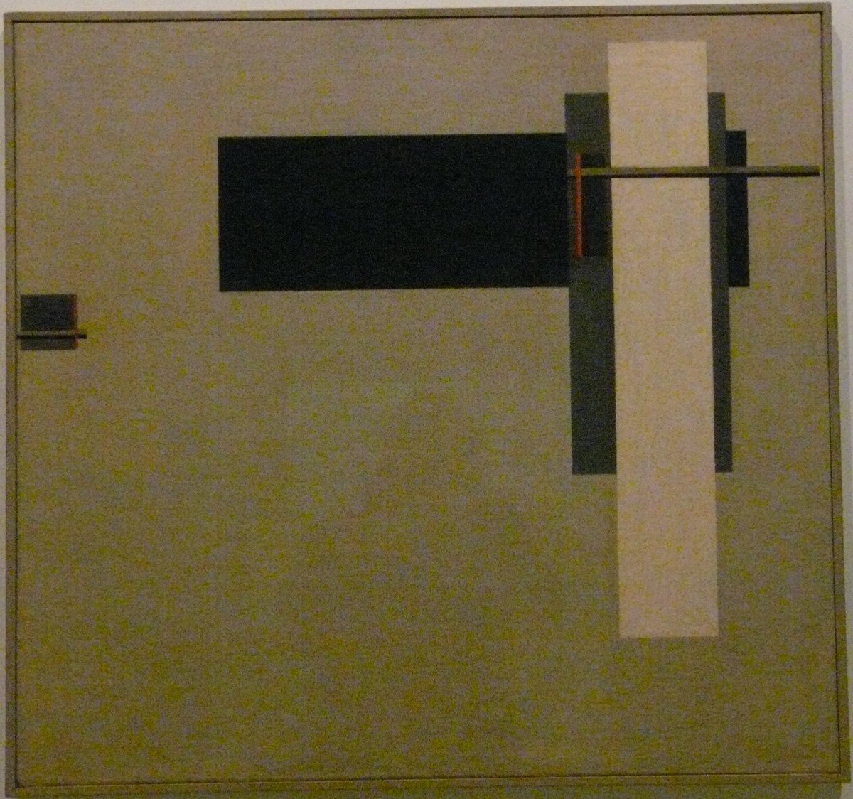
Out of that geometric abstraction, Lissitzky built his own Proun series, paintings that treated flat shapes as if they existed in three-dimensional architectural space. From there he moved into design work for the Soviet state. After 1921 he lived mostly in Weimar Germany, where his innovations in typography, exhibition design, and book design reached far beyond Soviet borders.
Alexander Rodchenko: Constructor of Everyday Propaganda
Alexander Rodchenko (1891-1956) co-founded Constructivism with his wife, the artist Varvara Stepanova, and worked first as a painter before turning to photomontage and photography as his primary tools. His photographic eye was as political as his posters: he shot subjects from sharply high or low angles specifically to shock the viewer out of habitual seeing, writing that a single familiar viewpoint amounted to looking through the same keyhole again and again.
That same instinct for disorientation and scale carried into his advertising and poster collaborations with Mayakovsky in the early 1920s for the state trading agency Mosselprom, and into his corporate identity work for the airline Dobrolyot, the ancestor of Aeroflot, for which he designed the Winged Hammer and Sickle logo. Rodchenko’s career shows how thin the line was between commercial graphic design and state propaganda in the 1920s Soviet Union: the same diagonal, high-contrast toolkit sold both a product and a Party line.
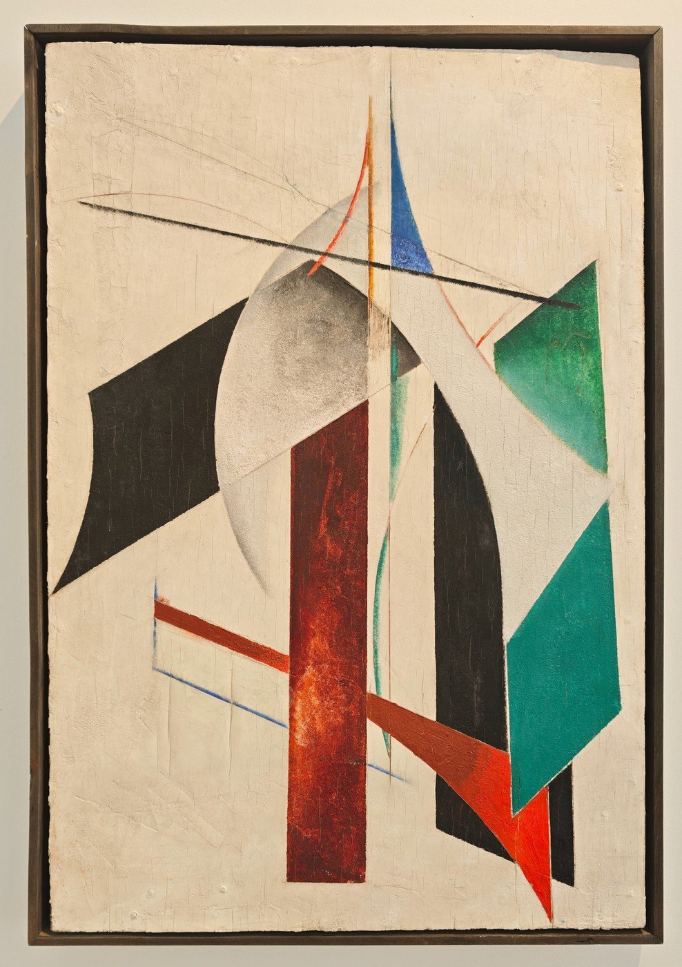
Look Closer: Look Closer: The Wedge Before the Poster
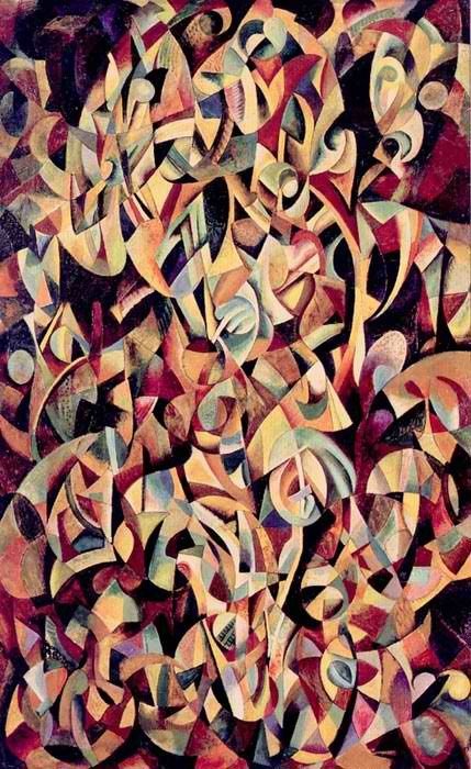
The diagonal red form in El Lissitzky’s Proun Vrashcheniya (about 1919) is the same geometric device he sharpened into an actual weapon shape for Beat the Whites with the Red Wedge that same year. Trace the angle in the Proun study and you can watch his abstract architecture turn into a political image piece by piece.
Notable Works: Reading Beat the Whites with the Red Wedge
Beat the Whites with the Red Wedge (1919) is the single image most art historians reach for when asked to explain Soviet Civil War propaganda in one picture. A red triangle, the Bolsheviks, drives into a white circle, the White movement, in a composition built entirely from Suprematist geometry rather than illustrated figures. There is no battlefield, no soldier, no blood. The abstraction itself carries the threat.
The poster’s afterlife outran its original purpose. When Lissitzky moved to Germany in 1921, Western publications picked up the image as visual shorthand for the entire Russian Civil War, detached from its specific 1919 context. Left-wing political and activist groups in Europe still use the red wedge today, often alongside the reclaimed red triangle that marked political prisoners under Nazi Germany, pairing two symbols born in opposite ideological catastrophes of the twentieth century.
The Stalinist Shift: From Avant-Garde to Socialist Realism
By the early 1930s, the angular abstraction of Constructivism and Suprematism fell out of official favor. The Party increasingly demanded Socialist Realism: legible, heroic, naturalistic figures a viewer could read as literal illustration rather than symbolic geometry. A muscular collective farmer or a smiling factory worker, rendered with academic modeling and correct anatomy, replaced Lissitzky’s wedges and circles.
The shift was not purely aesthetic. Abstraction was harder for censors to control precisely because its meaning was flexible, while a realistic figure left far less room for an unintended reading. Poster artists who had trained in avant-garde workshops had to relearn a more conservative, illustrative style or stop working in the medium entirely. Moor’s earlier single-figure format survived this transition better than Klutsis’s or Lissitzky’s geometric photomontage, since a bold, heroic figure fit Socialist Realism’s demands almost without modification.
The Great Terror and the Poster Artists
The stylistic purge of the early 1930s was followed by a literal one. During the Great Terror of 1937-38, Klutsis was arrested on fabricated charges, tried, and executed within weeks, one of millions caught in the same wave of political killings. His wife and collaborator, Valentina Kulagina, survived him but spent years afterward unable to work under her late husband’s name or exhibit the photomontages they had built together.
Artists who avoided arrest still worked under constant risk: a slogan that read as loyal one year could read as suspect the next if the official it praised fell from power, and a poster’s signed authorship made its creator personally accountable for its content in a way anonymous propaganda in most other countries never demanded.
Cold War Echoes and Global Influence
Soviet poster techniques did not stay inside Soviet borders. The diagonal composition, the cut red-and-black palette, and the collaged photograph all reappeared in interwar German and later Western advertising, protest art, and album covers, often stripped of their original political content and reused purely for visual punch. Lissitzky’s own move to Weimar Germany in 1921 put Constructivist poster language directly in front of Bauhaus designers, who carried elements of it into international graphic design education for the rest of the century.
During the Cold War, the same visual grammar ran in both directions: American and European anti-Communist posters borrowed the stark, high-contrast urgency of the Soviet originals to attack the system that produced it, proof that a persuasive graphic language survives the political content it was built to carry.
From Kremlin Walls to Gallery Walls: Soviet Posters Today
Original Soviet propaganda posters are now collected and studied as design history rather than active political material, held in institutions such as the State Tretyakov Gallery, the State Russian Museum, and university print collections outside Russia. Surviving originals vary widely in condition. Many were printed on cheap, acidic wartime paper never meant to last, so color often shifted and edges chipped over the decades. Conservators today weigh how much restoration a piece can take before it stops being the original object.
Where can you see original Soviet propaganda posters today?
Major public holdings include the State Russian Museum and State Tretyakov Gallery in Russia, along with specialized collections at institutions such as the Hoover Institution in the United States. Many museums have digitized their poster holdings, so high-resolution scans of ROSTA Windows and later Five-Year-Plan posters now circulate far more widely online than the fragile originals ever could in print.
Common Misconceptions
A common assumption holds that every Soviet poster was created anonymously by an uncredited state machine. In reality, artists like Moor, Klutsis, and Lissitzky signed their work, built individual reputations, and are studied today by name, the same way any other graphic artist would be.
Another misconception treats “Soviet poster style” as one unchanging look across seven decades. The geometric photomontage of the 1920s and the muscular realism of the 1930s onward are visually distinct movements produced by different political pressures, not two variations on a single template. Treating them as interchangeable erases exactly the stylistic shift, driven by censorship and changing Party doctrine, that makes the poster record valuable as a historical document.
Related Movements: Constructivism, Suprematism, and Beyond
Soviet poster design drew its geometric vocabulary directly from Suprematism, the abstract movement Kazimir Malevich founded around reducing painting to basic shapes and color, and from Constructivism, which pushed that abstraction toward a practical, industrial purpose: art as a tool for building the new state rather than an object for private contemplation. Lissitzky worked in both camps, moving from Suprematist theory under Malevich into Constructivist design practice.
Outside Russia, the closest parallel is German Bauhaus design, which absorbed Constructivist ideas through direct contact with emigre artists like Lissitzky in the 1920s. Later twentieth-century protest graphics, from Cuba’s OSPAAAL solidarity posters to Black Panther Party print work, drew on the same high-contrast, photomontage-driven approach the Soviet poster artists had pioneered decades earlier.
Essential Points
- ROSTA Windows solved a literacy problem as much as a speed problem: comic-panel sequences told a full story to viewers who could not yet read a paragraph of text.
- Glavlit’s power sat in revision, not just rejection, so most surviving posters carry evidence of a negotiated compromise rather than one artist’s unedited vision.
- Moor’s single-hero format proved durable enough to survive the 1930s style purge that killed off Constructivist geometry, showing how much stylistic survival depended on political flexibility.
- Klutsis’s photomontage borrowed the documentary authority of real photographs, a credibility that hand-drawn posters like Moor’s could not claim.
- The red wedge that meant Bolshevik victory in 1919 now reads, in Western left-wing use, as a general anti-fascist symbol detached from its original Civil War target.
- Rodchenko’s Aeroflot logo work shows Soviet graphic design flowing both ways: propaganda techniques sold products, and advertising techniques sold the state.
- The 1930s shift to Socialist Realism was easier to censor precisely because realistic figures leave less room for ambiguous reading than abstract geometry does.
- Bauhaus designers absorbed Constructivist poster language directly through Lissitzky’s presence in Weimar Germany, making the Soviet poster an underacknowledged source of modern Western graphic design.
Frequently Asked Questions
- What makes a poster ‘Soviet propaganda’ rather than just Soviet-era art?
- A poster counts as propaganda when a state body, not just an individual artist, directed or approved its message. Soviet posters passed through Party agitprop departments and Glavlit censorship before printing, which separates them from privately made Soviet-era paintings or independent graphic art of the same period.
- When did Soviet propaganda posters start and stop being produced?
- Mass poster production began around 1918 with the ROSTA Windows campaign during the Russian Civil War and continued in changing styles through the Five-Year-Plan era of the 1930s and into later Soviet decades, only tapering off with the political and economic changes of the 1980s.
- Why is red the dominant color in Soviet propaganda posters?
- Red carried practical and ideological weight: it was cheap to print, visible from a distance in low light, and already tied to the Bolshevik movement before the Revolution. Artists used it as the one color that had to register even on worn paper or a badly lit street corner.
- Was El Lissitzky primarily a poster artist?
- No. El Lissitzky worked mainly as a painter, typographer, and exhibition designer; propaganda posters like Beat the Whites with the Red Wedge were one part of a career that also included Proun paintings, book design, and architecture, most of it produced outside a strictly political context.
- Are original Soviet propaganda posters valuable today?
- Yes, especially rare Civil War-era and Constructivist pieces, since so few survived intact on fragile wartime paper. Institutions including the State Tretyakov Gallery and State Russian Museum hold major collections, and digitized scans have made the imagery, if not the physical originals, freely viewable online.
This guide was written and reviewed by the rus-art.com editorial team, specializing in Russian art history. We cross-check dates, attributions, and museum holdings against museum and academic sources.